Comparing a MySQL Query with a Data Table in R


Data tables are becoming an increasingly popular way of working with data sets in R. The syntax can become rather complex, but the framework is much faster and more flexible than other methods. The basic structure of a data table, though, if fairly intuitive–as it corresponds quite nicely with SQL queries in relational database management systems. Here’s the basic structure of a data table:

DT[i, j, by =],

where ‘i’ = WHERE, ‘j’ = SELECT, and by = GROUP BY in SQL

The easiest way to explain how the data table framework in R is like SQL, though, is to offer an example. So, that’s what we’re going to do. Let’s start by pulling a data set in R…

### bring data into R with data.table
install.packages("data.table")
library(data.table)
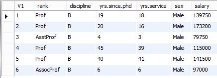
profs <- fread("https://vincentarelbundock.github.io/Rdatasets/csv/car/Salaries.csv")
head(profs)

After installing and loading the data.table package, we’ll be able to use the fread() function to import a data set as a data table. When we run the head() function on the profs data table, we can see what we’re looking at. We’ve got a collection of college profressors’ salaries based on a variety of factors.

profs1

Now, suppose we want to call the same information in MySQL. Here’s the code for that…

### select the first 6 rows of the profs table
select * 
from profs
limit 6;

And here’s the results of the query shown in the MySQL Workbench.

profs2

Pretty simple, right?

Now, let’s suppose we have a specific question we want to answer. What if we want to know whether or not there is a difference between salaries for males and females when they become full professors. How do we use a data table to do this in R. Here’s what the code looks like…

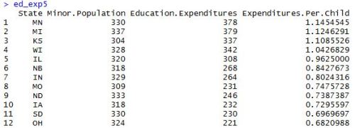
### find average full professor salary by gender
profs[rank == "Prof", 
 .(avg.salary = mean(salary)), 
 by = sex][order(-avg.salary)]

### step by step with notes comparing to my SQL
profs[ ### the [] subsetting of profs corresponds to the from clause in MySQL
 rank == "Prof", ### selects rows where rank is professor; corresponds to where clause in MySQL
 .(avg.salary = mean(salary)), ### selects the columns to return; corresponds to select clause in MySQL
 by = sex ### corresponds to the group by clause in MySQL
 ][order(-avg.salary)] ### adding a second [] subset with the order function corresponds to the order by clause in MySQL; the '-' in front of the ordered variable corresponds to the desc statement in MySQL

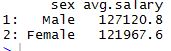
So, as the comments suggest, the three sections within the square brackets of the data table call correspond to what we want to do with the rows, columns, and groupings, respectively. In this scenario, we first select the rows of full professors, then select a column averaging the salaries of full professors, and finally group those full professors by gender. And, here’s what the output looks like.

profs3

If we want to write a query to retrieve this same information in MySQL, here’s what the code would look like…

### find average full professor salary by gender
select sex, avg(salary)
from profs 
where rank = 'Prof' 
group by sex 
order by salary desc; 

### step by step with notes comparing to R's data.table
select sex, avg(salary) ### selects the columns to return; corresponds to the 'j' section of R's data.table
from profs ### selects the table to pull data from; corresponds to the [] subsetting in R's data.table
where rank = 'Prof' ### selects the rows to return; corresponds to the 'i' section of R's data.table
group by sex ### groups the table by gender; corresponds to the 'by' section of R's data.table
order by salary desc; ### orders the table by highest salary to lowest; corresponds to the the order function in R's data.table

And here’s the result in the MySQL Workbench.

profs4

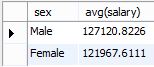
So, to answer our question, male full professors in our data set do indeed make slightly more on average than females who have risen to the same level in their careers.

Go ahead and experiment. What other subsets can you create from this data set using the data.table framework?

How to Summarize a Data Frame by Groups in R

Sometimes, when you’re analyzing a data set and you want to get a complete picture of it, you want calculate the metrics on all the observations for each variable. Let’s say, for example, that you run a small zoo and want to inventory the cost of all your animals. To calculate this in a spreadsheet, you simply, sum the cost of all the rows in the “cost” column.

But, what do you do if you want to know the cost broken down by each category of animal? In a spreadsheet, you would subtotal the “cost” column by the column referencing the animal’s class. The result would be something like below–with the original data set on the left and the subtotaled data set on the right.

subtotal

If you’re working with databases, it’s even easier to achieve the result with a simple SQL query. If the table you’re working in is called “animals,” the query would look something like this:

SELECT Class, sum(Cost) FROM animals GROUP_BY Class;

And the result is pretty much the same. So, the question is, if you can do this in spreadsheets and databases, can you do it in R? You bet you can.

In the dplyr package, you can create subtotals by combining the group_by() function and the summarise() function. Let’s start with an example. Below is the first part of the mtcars data frame that is provided in the base R package.

mtcars1

Now, suppose we interested in purchasing a car. We’re interested in 3 things regarding the car we’re seeking to purchase: the fuel economy, the power, and the speed. However, we’re unsure how the number of cylinders relates to these variables. How can we view the averages by cylinder? Let’s look at some code.

### group mtcars by cylinders and return some averages
cars <- mtcars %>%
select(cyl, mpg, hp, qsec) %>%
group_by(cyl) %>%
summarise(mpg = mean(mpg), hp = mean(hp), qsec = mean(qsec))

Here, we’ve used piping with dplyr functions to crew a data set showing us the average mpg, hp, and qsec (seconds it takes to go 1/4 a mile) for each amount of cylinders. When we print the new “cars” data frame, here’s what we get:

mtcars2

This gives us a summary that can help us more easily make a decision. If we want to see this plotted on graphs, we can run this code…

### draw plots of cylinders vs other variables
par(mfrow = c(1,3), lwd = 4)
plot(cars$cyl,cars$mpg, main = "Cylinders Vs Miles Per Gallon", xlab = "Miles Per Gallon", ylab = "Number of Cylinders", type = "h", col = "Red")
plot(cars$cyl,cars$hp, main = "Cylinders vs Horsepower", xlab = "Horsepower", ylab = "Number of Cylinders", type = "h", col = "Blue")
plot(cars$cyl,cars$qsec, main = "Cylinders vs Quarter Mile Time", xlab = "Quarter Mile Time in Seconds", ylab = "Number of Cylinders", type = "h", col = "Green")

And here’s what we end up with…

mtcars3

It looks like increasing the number of cylinders decreases the fuel economy, but it increases the power and speed.

Also worth noting, the mpg and qsec change at roughly the same rate going from 6 to 8 cylinders than they do going from 4 to 6 cylinders. However, the horsepower jumps up more dramatically when going from 6 to 8 cylinders than going from 4 to 6 cylinders. So, if power is relatively more important to you, you may want to go ahead and go with 8 cylinders.

Create, Interpret, and Use a Linear Regression Model in R

In my last post, we looked at how to create a correlation matrix in R. Specifically, we used data pulled from the web to see which variables were most highly correlated with an automobile’s fuel economy. Suppose, however, that we are trying to guess the fuel economy of a new car without actually having driven it. Is there a way for us to use the things we do know about the car to predict how many miles per gallon it will get?

When you’re trying to figure out how multiple variables interact to produce an effect in another variable, you’ll want to perform a regression analysis. There are many programs in which you can do this–SAS, SPSS, Stata, and even to a limited extent in Microsoft Excel. Heck, if you’ve got enough time to kill and brain power to exhaust, you can even do it with a pencil and paper.

Of course, given the nature of this blog, we’re going to perform a simple regression analysis using R. And it’s surprisingly fairly simple to generate the output. Let’s have a look at some code…

motorcars <- read.csv("https://vincentarelbundock.github.io/Rdatasets/csv/datasets/mtcars.csv", stringsAsFactors = FALSE)

head(motorcars)

The first thing we’ll do, as in many other situations, is read in some data and take a look at it. When we import the “motorcars” dataset and call the head() function on it, here’s what we get…

headmc

Now is the part where we use our subject matter expertise and basic human experience to evaluate which variables we think may influence the mpg of a particular vehicle. (Here’s the document explaining what the variable names mean). For argument’s sake, let’s say we determine the displacement (disp), the weight (wt), and the horsepower (hp) to be the only variables we think could really have an effect on the fuel economy of the car. So, those are the ones we decide to put into our model. Let’s look at the code on how to build the model…

mc_model <- lm(motorcars$mpg ~ motorcars$disp + motorcars$wt + motorcars$hp)

summary(mc_model)

So, we actually create the model with the lm() function. Inside the function, we use the basic framework of “the independent variable (the one we’re trying to predict) is equal to variable1 + variable2 + variable3, and so on…” However, instead of the “=” sign, we use the “~” sign. Then, we assign the model to a named object–in this case “mc_model.”

Once, we’ve created the model and assigned a name to it, we can call the summary() function on it to get an overview of the results. Here’s what the output looks like for the model we’ve created…

mc_model1

Now, for simplicity’s sake, I’m just going to interpret a few components of the model. The first thing you’ll want to look at is the “p-value” in the bottom right corner of this summary. This number tells you whether or not the model is “statistically significant,” given your criteria. Essentially, it’s the probability that the outcome of the model is due to random chance. Generally, practitioners use 0.05 as a threshold–such that anything less than that is deemed acceptable. So, we can see that our model as a whole is statistically significant–or usable for making predictions.

Next, let’s look at the far right column of the table labeled “Coefficients,” with the header “Pr(>|t|).” This column contains the “p values” of each individual variable we are considering. Even if the model as a whole is statistically significant, there still may be some variables within it that are not. In this case, we can see that the “displacement” variable is not statistically significant by virtually any measure. So, we can decide to throw that out of our model. So, going forward, let’s look only at the other two variables: “weight” (wt) and “horsepower” (hp).

The last thing we’ll need to look at for our purposes is the “Estimate” column of the “Coefficients” table. Ignoring the “motorcars$disp” variable, we’ll look at the other three. The “Intercept” is what the model begins with before weight and horsepower are taken into consideration. Or, given the information in the model, it’s the miles per gallon the car will get if it has no weight and no horsepower.

For the “motorcars$wt” and “motorcars$hp” variables, you’ll multiply the estimate by each unit of weight and horsepower, respectively. Then, you’ll add the results together with the “Intercept” to conclude how many miles per gallon your car will get. Here’s the formula for our model:

miles per gallon = 37.105505 + (weight[in 1000s] * -3.800891) + (horsepower * -0.031157)

So, let’s say we have a car that weights 2000 pounds and has 100 horsepower. How many miles per gallon can we expect it to get? If we compute this in R, here’s what it will look like…

mc_model2

So, given our model, we can expect a car that weights 2000 pounds and has 100 horsepower to get about 26.4 miles per gallon.

Now, let’s suppose we have a huge list of cars on which we want to run this model. It would be tedious to have to type in those numbers over and over again. Is there anything we can do about it?

Of course, there is. We can create a function that has our dependent variables (weight and horsepower) as inputs. Then, all we have to do is put in the weight and horsepower of each car and the miles per gallon will return as a result. Here’s what the code for that looks like:

mc_fun <- function(weight,horsepower) {
37.105505 + (weight * -3.800891) + (horsepower * -0.031157)
}

args(mc_fun)

mc_fun(2,100)
mc_fun(2.5,150)
mc_fun(3,200)
mc_fun(5,350)

Now, whatever combination of weight and horsepower we input into the mc_fun function, we’ll get an output of miles per gallon. To check the order in which you’ll input the variables, use the args() function.

In the code above, I’ve included four examples–increasing in weight and horsepower. I start with our original example of a 2000 pound car with 100 horsepower and go all the way up to a 5000 pound car with 350 horsepower. Based on our model, we can expect the fuel economy to decrease as the weight and horsepower increases. Does this actually happen? Let’s look at the output to find out…

mc_model3

Consistent with our original formula example, a car with a weight of 2000 pounds and 100 horsepower gets 26.4 miles per gallon. If, however, we’ve got our hearts set on buying that massive yet agile tank of an automobile weighing 5000 pounds and getting 350 horsepower, we’ll have to settle for a measly 7.2 miles per gallon.

If we’re set on buying the boat, we might want to live very close to a gas station…

Examine a Data Frame in R with 7 Basic Functions

When I first started learning R, it seemed way more complicated than what I was used to with looking at spreadsheets in Microsoft Excel. When I started working with data frames in R, it didn’t seem quite as easy to know what I was looking at.

I’ve since come to see the light. While there is a bit of a learning curve to get a handle on it, viewing data in R is infinitely more flexible than doing so in Excel. In this post, I’ll cover the most basic R functions for examining a data set and explain why they’re important.

Understanding how to get a simple overview of the data set has become a huge time saver for me. If you aren’t familiar with these functions, you need to be. If you’re anything like me, you’ll use them first for every single data set you consider.

All of the functions I’m discussing here come in the base R Utils package, so there’s no need to install any additional packages. Here are the functions, with links to their documentation:

  1. dim(): shows the dimensions of the data frame by row and column
  2. str(): shows the structure of the data frame
  3. summary(): provides summary statistics on the columns of the data frame
  4. colnames(): shows the name of each column in the data frame
  5. head(): shows the first 6 rows of the data frame
  6. tail(): shows the last 6 rows of the data frame
  7. View(): shows a spreadsheet-like display of the entire data frame

Now, let’s import a data set see how each of these functions works. First, here’s the code:

### Import a data set on violent crime by state and assign it to the data frame "crime"
crime <- read.csv("http://vincentarelbundock.github.io/Rdatasets/csv/datasets/USArrests.csv", stringsAsFactors = FALSE)

### Call the functions on crime to examine the data frame
dim(crime)
str(crime)
summary(crime)
colnames(crime)

### The head() and tail() functions default to 6 rows, but we can adjust the number of rows using the "n = " argument
head(crime, n = 10)
tail(crime, n = 5)

### While the first 6 functions are printed to the console, the View() function opens a table in another window
View(crime)

Now, let’s take a look at the output, so we can see what happens when the code is run.

First, we’ll look at the dim(), str(), summary(), and colnames()  functions:

crime1

  • dim(): In the crime data set, we can see immediately that there are only 50 rows and 5 columns. This function is useful, because it tells us whether it would be okay to print the entire data frame to the console. With this data set, it’s probably okay. If, however, there were 5,000 rows and 50 columns, we’d definitely want to view the data frame in smaller chunks.
  • str(): The structure of the crime data set also tells us the number of rows (observations) and columns (variables), but it provides even more information. It tells us the column names, the class of each column (what kind of data is stored in it), and the first few observations of each variable.
  • summary(): The summary provides descriptive statistics including the min, max, mean, median, and quartiles of each column. For example, we can see in the crime data set that the average murder rate across all states is 7.8 for every 100k people.
  • colnames(): This function prints a vector of the column names, which can be useful if you’re trying to reference a particular column. For the crime data set, we can see that the state column has no name. Knowing this, we may want to assign it a name before going forward in our analysis.

Now, let’s take a look at the head() and tail() functions:

crime2

  • head(): This function defaults to printing the first 6 rows, but we’ve decided to call the first 10. In the crime data set, this gives us the data on states Alabama through Georgia.
  • tail(): The same as head(), except this function prints the end of the data frame. In this case, we’ve called the last 5 observations, so we can see the data on Virginia through Wyoming.

Finally, let’s take a look at the window that appears when we call the View() function:

crime3

  • View(): This window provides vertical and horizontal (if enough columns to justify) scroll bars for you to browse the entire data set. It looks exactly like an Excel spreadsheet–you just can’t manipulate any of the data. (Note: make sure you use a capital “V” when calling this function; it’s case sensitive).

That’s it! Getting comfortable with these functions should make it easier for you to work with data frames in a more logical and efficient manner. 

Happy viewing!

5 Ways to Subset a Data Frame in R

Often, when you’re working with a large data set, you will only be interested in a small portion of it for your particular analysis. So, how do you sort through all the extraneous variables and observations and extract only those you need? Well, R has several ways of doing this in a process it calls “subsetting.”

The most basic way of subsetting a data frame in R is by using square brackets such that in:

example[x,y]

example is the data frame we want to subset, ‘x’ consists of the rows we want returned, and ‘y’ consists of the columns we want returned. Let’s pull some data from the web and see how this is done on a real data set.

### import education expenditure data set and assign column names
education <- read.csv("https://vincentarelbundock.github.io/Rdatasets/csv/robustbase/education.csv", stringsAsFactors = FALSE)
colnames(education) <- c("X","State","Region","Urban.Population","Per.Capita.Income","Minor.Population","Education.Expenditures")
View(education)

Here’s what the first part of our data set looks like after I’ve imported the data and appropriately named its columns.

edexp1

Now, let’s suppose we oversee the Midwestern division of schools and that we are charged with calculating how much money was spent per child for each state in our region. We would need three variables: State, Minor.Population, and Education.Expenditures. However, we would only need the observations from the rows that correspond to Region 2. Here’s the basic way to retrieve that data in R:

ed_exp1 <- education[c(10:21),c(2,6:7)]

To create the new data frame ‘ed_exp1,’ we subsetted the ‘education’ data frame by extracting rows 10-21, and columns 2, 6, and 7. Pretty simple, right?

Another way to subset the data frame with brackets is by omitting row and column references. Take a look at this code:

ed_exp2 <- education[-c(1:9,22:50),-c(1,3:5)]

Here, instead of subsetting the rows and columns we wanted returned, we subsetted the rows and columns we did not want returned and then omitted them with the “-” sign. If we now call ed_exp1 and ed_exp2, we can see that both data frames return the same subset of the original education data frame.

edexp2

Now, these basic ways of subsetting a data frame in R can become tedious with large data sets. You have to know the exact column and row references you want to extract. It’s pretty easy with 7 columns and 50 rows, but what if you have 70 columns and 5,000 rows? How do you find which columns and rows you need in that case? Here’s another way to subset a data frame in R…

ed_exp3 <- education[which(education$Region == 2),names(education) %in% c("State","Minor.Population","Education.Expenditures")]

Now, we have a few things going on here. First, we are using the same basic bracketing technique to subset the education data frame as we did with the first two examples. This time, however, we are extracting the rows we need by using the which() function. This function returns the indices where the Region column of the education data from is 2. That gives us the rows we need. We retrieve the columns of the subset by using the %in% operator on the names of the education data frame.

Now, you may look at this line of code and think that it’s too complicated. There’s got to be an easier way to do that. Well, you would be right. There is another basic function in R that allows us to subset a data frame without knowing the row and column references. The name? You guessed it: subset().

ed_exp4 <- subset(education, Region == 2, select = c("State","Minor.Population","Education.Expenditures"))

The subset() function takes 3 arguments: the data frame you want subsetted, the rows corresponding to the condition by which you want it subsetted, and the columns you want returned. In our case, we take a subset of education where “Region” is equal to 2 and then we select the “State,” “Minor.Population,” and “Education.Expenditure” columns.

When we subset the education data frame with either of the two aforementioned methods, we get the same result as we did with the first two methods:

edexp3

Now, there’s just one more method to share with you. This last method, once you’ve learned it well, will probably be the most useful for you in manipulating data. Let’s take a look at the code and then we’ll go over it…

install.packages("dplyr")
library(dplyr)
ed_exp5 <- select(filter(education, Region == 2),c(State,Minor.Population:Education.Expenditures))

This last method is not part of the basic R environment. To use it, you’ve got to install and download the dplyr package. If you’re going to be working with data in R, though, this is a package you will definitely want. It is among the most downloaded packages in the R environment and, as you start using it, you’ll quickly see why.

So, once we’ve downloaded dplyr, we create a new data frame by using two different functions from this package:

  • filter: the first argument is the data frame; the second argument is the condition by which we want it subsetted. The result is the entire data frame with only the rows we wanted.
  • select: the first argument is the data frame; the second argument is the names of the columns we want selected from it. We don’t have to use the names() function, and we don’t even have to use quotation marks. We simply list the column names as objects.

In this example, we’ve wrapped the filter function in the selection function to return our data frame. In other words, we’ve first taken the rows where the Region is 2 as a subset. Then, we took the columns we wanted from only those rows. The result gives us a data frame consisting of the data we need for our 12 states of interest:

edexp4

So, to recap, here are 5 ways we can subset a data frame in R:

  1. Subset using brackets by extracting the rows and columns we want
  2. Subset using brackets by omitting the rows and columns we don’t want
  3. Subset using brackets in combination with the which() function and the %in% operator
  4. Subset using the subset() function
  5. Subset using the filter() and select() functions from the dplyr package

That’s it! Happy subsetting!

Nesting Functions in R with the Piping Operator

One of the most useful (and most popular) applications in R are the functions available in the dplyr package. With functions like select, filter, arrange, and mutate, you can restructure a data set to get it looking just the way you want it. The problem is that doing so can take multiple steps. As a result, you either end up creating a bunch of extraneous objects to keep your activities organized, or you end up nesting your activities in one long convoluted line of nested functions. Is there a better way to create cleaner code with dplyr? Let’s have a look…

### import education expenditure data set and assign column names
education <- read.csv("https://vincentarelbundock.github.io/Rdatasets/csv/robustbase/education.csv", stringsAsFactors = FALSE)
colnames(education) <- c("X","State","Region","Urban.Population","Per.Capita.Income","Minor.Population","Education.Expenditures")
View(education)

First, we’ve taken a data set on education expenditures by state and given the columns appropriate names. For a more detailed explanation on ways to subset this data set, visit this post. Here’s a snapshot of what the first half of the data set looks like:

edexp1

Now, let’s supposed we are tasked with answering a very specific question:

Which states in the Midwestern region of the United States have the highest and lowest education expenditures per minority resident?

Let’s use the dplyr functions to filter this information from the data set–one step at a time…

### Filter for Region 2
ed_exp1 <- filter(education, Region == 2)

### Select the State, Minor Population, and Education Expenditures columns
ed_exp2 <- select(ed_exp1, c(State, Minor.Population, Education.Expenditures))

### Add a column for the Expenditures Per Child
ed_exp3 <- mutate(ed_exp2, Expenditures.Per.Child = Education.Expenditures / Minor.Population)

### Arrange the data set to sort by Expenditures.Per.Child
ed_exp4 <- arrange(ed_exp3, desc(Expenditures.Per.Child))

Building our data frame this way, we create four separate objects to reach our goal. With each activity, we assign a new object and then feed that object as the new data frame into the next activity. We first filter the original data set, creating ed_exp1. Then, we apply the select function on ed_exp1, creating ed_exp2, and so on until we end up with our final result in ed_exp4. And, sure enough, this method works:

edexpenses1

We can now answer our question: Ohio spends the least amount per child and Minnesota spends the most.

That being said, ed_exp4 is not the only data frame we’ve created.In getting our result, we have created several intermediary objects. We have no use for ed_exp1, ed_exp2, or ed_exp3. The final result–what we’ve called ed_exp4–is the only revised data frame we care about. And yet, these other three data sets are taking up space in our working memory:

edexpenses2

None of these subsets give us the complete information to answer our question. All we need is the final result–ed_exp4. So, is there a way to get to ed_exp4 without creating the first three objects. Yes, there is–but it’s a little tricky…

### Create final result using a single nested function
ed_exp5 <- arrange(mutate(select(filter(education, Region == 2),c(State,Minor.Population, Education.Expenditures)), Expenditures.Per.Child = Education.Expenditures / Minor.Population),desc(Expenditures.Per.Child))

So, what is happening in this long, convoluted line of code? We are nesting each object as the data frame in the function that creates the next object. The innermost function, filter, creates the result that serves as the data frame for the select function, and then it builds all the way out to our last activity–arrange. As we see below, ed_exp5 gives us the same result as ed_exp4–and we only have to create one object.

edexpenses3

The downside to using this method is rather obvious–it’s too complicated! Sure, we save space by not creating extraneous variables, but the trade off is that we have a long line of code that’s difficult to understand. The more activities we do to create our resulting data frame, the farther apart our arguments will get from the functions we are trying to apply to them. Sooner or later, mistakes will become inevitable.

But there is a fix even for this! Included as part of the dplyr package is the documentation for the “piping” operator. It essentially does the same thing as nesting functions does, but it’s a lot cleaner. Let’s have a look at the code…

### Create final result using the piping operator
ed_exp6 <- education %>%
filter(Region == 2) %>%
select(c(State, Minor.Population, Education.Expenditures)) %>%
mutate(Expenditures.Per.Child = Education.Expenditures / Minor.Population) %>%
arrange(desc(Expenditures.Per.Child))

The piping operator, delineated by the “%>%” symbol, funnels each object preceding the operator as the first argument in subsequent functions. In other words…

education %>% filter(Region = 2)

is the same thing as…

filter(education, Region == 2)

You simply continue linking the chain, or “extending the pipe,” all the way down to your last action. In our case, the final action is to arrange the data set, so that’s where our pipe ends.

So, the moment of truth–does the piping operator give us the result we’re looking for?

edexpenses4

Indeed, it does! But we’re only creating a single object and the code is much, much cleaner.

Pretty cool, huh?

Create a Correlation Matrix in R

So, in my last post, I showed how to create two histograms from a certain data set and then how to plot the two variables to see if there is any relationship. Visually, it was easy to tell that there was a negative relationship between the weight of an automobile and the fuel economy of an automobile. But, is there a more objective way to understand the relationship? Is there a number we can assign to it?

Yes, it turns out there is. This number is called Pearson’s Correlation Coefficient or, in the vernacular, simply the “correlation.” Essentially, this number measures the percentage of fluctuation in one variable that can be explained by another variable. A correlation of 1 means the variables move in perfect unison, a correlation of -1 means the variables move in the complete opposite direction, and a correlation of 0 means there is no relationship at all between the two variables.

So, how to we retrieve the correlation between two variables in R? Let’s write some code…

motorcars <- read.csv("https://vincentarelbundock.github.io/Rdatasets/csv/datasets/mtcars.csv", stringsAsFactors = FALSE)

cor(motorcars$wt, motorcars$mpg)

plot(motorcars$wt, motorcars$mpg)

First, we import the same data set we used last time. When we view the data set (using colnames() or head()), we see that the column names for the variables we are trying to measure are “wt” and “mpg.” Now, all we need to do is subset these two variables with the dollar sign and place them within the cor() function.

mccor

When we run this code, we can see that the correlation is -0.87, which means that the weight and the mpg move in exactly opposite directions roughly 87% of the time. So, that’s it. You’ve run a correlation in R. If you plot the two variables using the plot() function, you can see that this relationship is fairly clear visually.

mtplot

But, wait? Could there be other things that are related to the fuel economy of the vehicle, besides weight? What else is in the data set? Let’s have a look. When we run the head() function on motorcars, we get the first 6 rows of every column in the data set.

headmc

What if we want to see how all of these variables are related to one another? Well, we could run a correlation on every single combination we can think of, but that would be tedious. Is there a way we can view all the correlations with a single line of code? Yes, there is.

mc_data <- motorcars[,2:length(motorcars)]
round(cor(mc_data),2)

First, we create a separate data frame that only includes the data from motorcars (subsets everything to the right of the vehicle model name). Then, we simply run a correlation on the new data frame, which we’ve called “mc_data.” To clean things up a bit, I’ve nested the cor() function within the round() function to round the result to two decimal places. When we enter this code, here’s what we get:

corrmat

We can see that there are several other variables that are related to mpg, such as cyl, disp, and hp. Now, we can plot the variables that are most correlated with miles per gallon using this code (refer to previous post for explanation).

par(mfrow = c(2,2))
plot(motorcars$wt, motorcars$mpg)
plot(motorcars$cyl, motorcars$mpg)
plot(motorcars$disp, motorcars$mpg)
plot(motorcars$hp, motorcars$mpg)

And, here’s what we get as a result…

mtplots

Create Histograms and Scatter Plots in R for Exploratory Data Analysis

No matter how sophisticated you get with your statistical analysis, you’ll usually start off exploring your data the same way. If you’re looking at a single variable, you’ll want to create a histogram to look at the distribution. If you’re trying to compare two variables to see if there is a relationship between them, you’ll want to create a scatter plot. R makes both of these really easy. Let’s look at some code…


motorcars <- read.csv("https://vincentarelbundock.github.io/Rdatasets/csv/datasets/mtcars.csv", stringsAsFactors = FALSE)

par(mfrow = c(1,3))

hist(motorcars$wt, main = "Weight", xlab = "Weight (in 1000s)")
hist(motorcars$mpg, main = "MPG", xlab = "Miles Per Gallon")

plot(motorcars$wt, motorcars$mpg, main = "Weight Vs MPG", xlab = "Weight (in 1000s)", ylab = "Miles Per Gallon")

First, we pull some data from the web and read it into a data frame called “motorcars.” This data frame compares 32 cars across 11 different variables. You can get an overview of the data frame by calling str(), summary(), or head() on the data frame (i.e. str(motorcars)).

In this example, we are wanting to look specifically at the weight of each car and the miles per gallon clocked for each car. We want to see how the distributions of these variables are spread out, and we also want to see if there is any relationship between them. Does a heavier car actually have an effect on the car’s fuel economy, or is that just an urban legend?

After we pull the data, we use the par() function to describe how we want the plots to be displayed. The mfrow argument creates a matrix of rows and columns that serves as the layout for the plots. In this case, we’ll want three plots laid side-by-side (1 row and 3 columns).

Next, we create the histograms, subsetting columns we are looking for by wedging the $ between the data frame’s name and the column’s name. Technically, this is all we have to do to create the histogram. The other arguments I’ve included are optional arguments to give histograms names and x-axis labels.

Finally, we’ll create the scatter plot with the plot() function. The plot() function takes two arguments: the first is what we want plotted on the x-axis, and the second is what we want plotted on the y-axis. In this case, we’ve chosen to use the weight on the x-axis and the miles per gallon on the y-axis.

After you run this code, here are the plots that are generated:

Effect of Vehicle Weight on Miles Per Gallon

So, what do you think?

What is the weight range of most motor vehicles? What MPG do most motor vehicles have? Is there any relationship between the two of them?

Create a Function in R to Calculate the Subtotal After Discounts and Taxes

One of the coolest things you can do in R is write custom functions to solve your own unique problems. I’m not sure I’m brave enough to try my hand at more complex functions with loops and conditionals and such but, for now, I thought I’d share something simple.

Suppose you have a list of transactions and you are trying to get the total amount from all of them. Of course, you can just call the sum() function on the individual transactions. But what if you get a discount on all the transactions? Then, what if there are taxes? Obviously, you can just do this with simple math. But, humor me. Here’s a function for it…

### create subtotal function
sub_tot <- function(costs,discount = 0,tax = 0) {
raw_sub <- sum(costs) - (sum(costs) * discount) + (sum(costs) * tax)
round(raw_sub, digits = 2)
}

The sub_tot function that I’ve created takes three arguments. The first is a vector of data that you want to total. The second is the percentage discount you get on all the transactions–expressed as a decimal. The third argument is the tax rate that is applied after the discounts are taken into consideration.

If you look at the function, all I do is subtract the discounted amount from the total, add the amount of taxes, and then round to two decimal places. Pretty simple, right? Now, let’s try it out on something…

### install and load readr package
install.packages("readr")
library(readr)

### import data set of sales transactions
sales <- read_csv("http://samplecsvs.s3.amazonaws.com/SalesJan2009.csv")

### print sum of all purchases before any discounts or taxes
sum(sales$Price)

### print sum of all purchases after discounts and taxes
sub_tot(sales$Price,0.15,0.08)

### taking taxes into account, how much did we save with the discount?
sum(sales$Price) - sub_tot(sales$Price,0.15,0.08)

Let’s pull a random set of real estate transactions from the web and store it into a data frame called “sales.” If we view the data set, we’ll see that there is a column called “Price.”

Now, let’s suppose you are a real estate developer who is buying up all these properties. You get a 15% discount on all that you buy, and there is an 8% tax rate. How much do you spend in all?

When we use the sub_tot function, here’s what we get…

sub_tot

So, before the discounts and taxes, you spend ~$1.6 million. After the discounts and taxes, you spent ~$1.5 million–which mean that you save a total of ~$100k.

But, suppose you didn’t get the discount. How much would you spend without the discount but taking into consideration the taxes? And, how much after-tax money do you save by getting the 15% discount vs not getting it? Let’s write some more code…

### what if you don't get a discount? how much do you spend?
sub_tot(sales$Price,,0.08)

### how much do you save with the discount vs not having the discount?
sub_tot(sales$Price,,0.08) - sub_tot(sales$Price,0.15,0.08)

Since “0” is set as the default argument for discount and tax, we simply skip the discount argument when there is no discount. So, when we run the above code, we find that the subtotal without a discount is ~$1.76 million and the after-tax amount you save by getting the discount is ~$250k.

sub_tot2

Now, want to send some of that money my way???


Use R to Combine Multiple Columns of Data into a Single Column Spread Out Across Rows

I work a lot with Pivot Tables in Microsoft Excel. A problem I often encounter is trying to analyze a spreadsheet in which data from a single variable has been spread out over many columns. In particular, this happens rather frequently with longitudinal data.

If you are trying to look at data spread out across multiple years, it can be difficult to use a Pivot Table when each year has a designated column. What you want instead is to have a single column with the header “Year” and all of the data placed in the adjacent column as a “Values” column. Let me show you what I mean…

Let’s take this data set showing the population of all countries between 1980 and 2010, taken from data.gov, and try to look at it within a pivot table.

Here’s what the raw data looks like (I added the “country” header” for simplicity):

pop_data1

In Excel, you can easily make a simple graph using the data as it’s currently displayed. However, if you want to drop it into a pivot table for dynamic filtering, analysis, and visualization, it can get tricky. To include all the data in your Pivot Table, you have to drop each year individually into the “values” field of the pivot table. Then, if you want to exclude any of the years, you’ll have to manually remove them. This can be extremely time consuming, and it prevents you from performing many of the calculations available in the pivot table (i.e. “year over year percentage change”).

pop_data2

So, how can you get all of those columns into a single “Year” column so that you can analyze the data more efficiently in a pivot table? In R, there is a simple way to do this. Using the tidyr package, we can “gather” all of those columns into a single column under one variable. Let’s take a look at the code…

### install and load tidyr package
install.packages("tidyr")
library(tidyr)

### import population by country by year from data.gov
pop_wide <- read.csv("http://en.openei.org/doe-opendata/dataset/a7fea769-691d-4536-8ed3-471e993a2445/resource/86c50aa8-e40f-4859-b52e-29bb10166456/download/populationbycountry19802010millions.csv", stringsAsFactors = FALSE, check.names=FALSE)

### assign column name to the first column
colnames(pop_wide)[1] <- "country"

### combine the year columns into a single column with separate rows for each year; assign to new vector
pop_long <- gather(pop_wide,year,population,-country)

### download the new csv to your working directory
write.csv(pop_long,"population_data.csv")

After you import and load the tidyr package, simply import the file and give the column of countries a name. Then, use the gather() function to pull all of those columns into a single column with adjacent values.

The first argument is the data frame you are working in (‘pop_wide’ in our case), the second argument is what you want the variable column to be (‘year’ in our case), and the third argument is what you want the values column to be (‘population’ in our case).  The last argument consists of the columns you want to be combined. You can also select instead the columns you don’t want to combine using the ‘-‘ sign, which is what we did with the ‘country’ column.

After we send the file back to our computer with write.csv, we can open the file up in Excel to see how it looks.

pop_data3

Now, the spreadsheet is going to list every country’s population for 1980, then 1981, then 1982, and so on. In general, this is how you want your raw data to look. If, however, you want the high level summary you started with, you can split the data back into multiple columns with tidyr’s spread() function. But, for now, let’s see how this looks in a pivot table…

pop_data4

If you look at the pivot table “Values” field, you’ll see that it’s a lot less messy. Now, you can manipulate the data much more easily. Want to create a pivot chart showing the increase in population within North America from 1980 to 2010? You can now do this in just a few seconds…

North America Population Growth Over Time